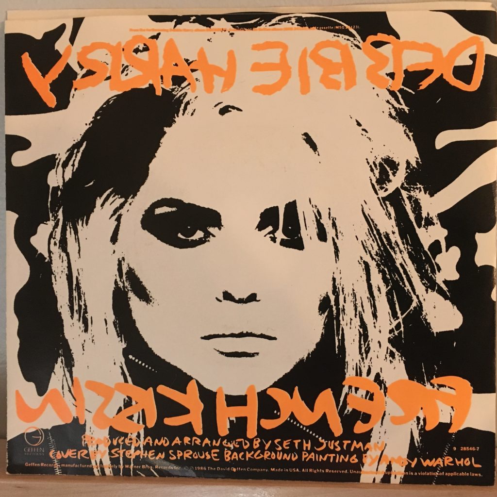
So, after my disappointment in most things Blondie after “Parallel Lines,” and my extreme antipathy toward Deborah Harry’s 1981 solo outing “KooKoo,” I normally would have just been done – I tend to give an artist a limited number of chances to disappoint me, because I don’t want to ruin what I love about their previous work.
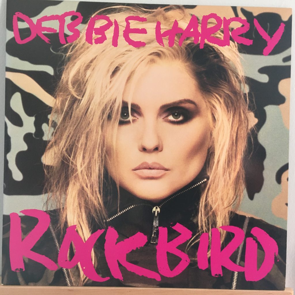
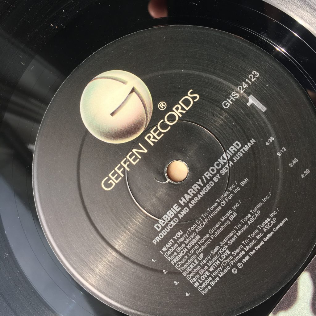
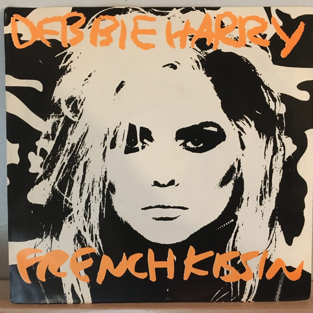
But then her second solo album, “Rockbird,” came out in 1986. Produced by Seth Justman of J. Geils Band, it is not exactly a return to form — it lacks the bite of her Blondie material — but it is a positive piece of fluffy pop that is just enjoyable (instead of trying to be important), and I loved it from the start. The big single, “French Kissin’ in the USA,” written by Chuck Lorre before he became a huge TV producer, is just a bit of fluff, but very fun in the way it’s handled. For a 1986 record, it isn’t all synthed up — in fact, it prominently features the Uptown Horns all over it, and as a result stands out from a lot of what was going on, as poppy as it is.
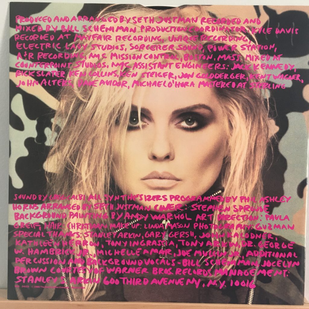
Where KooKoo’s graphics were by H.R. Giger and so dark that some stores refused to carry it, this look from fashion designer Stephen Sprouse is kinda perfectly mid-‘80s.
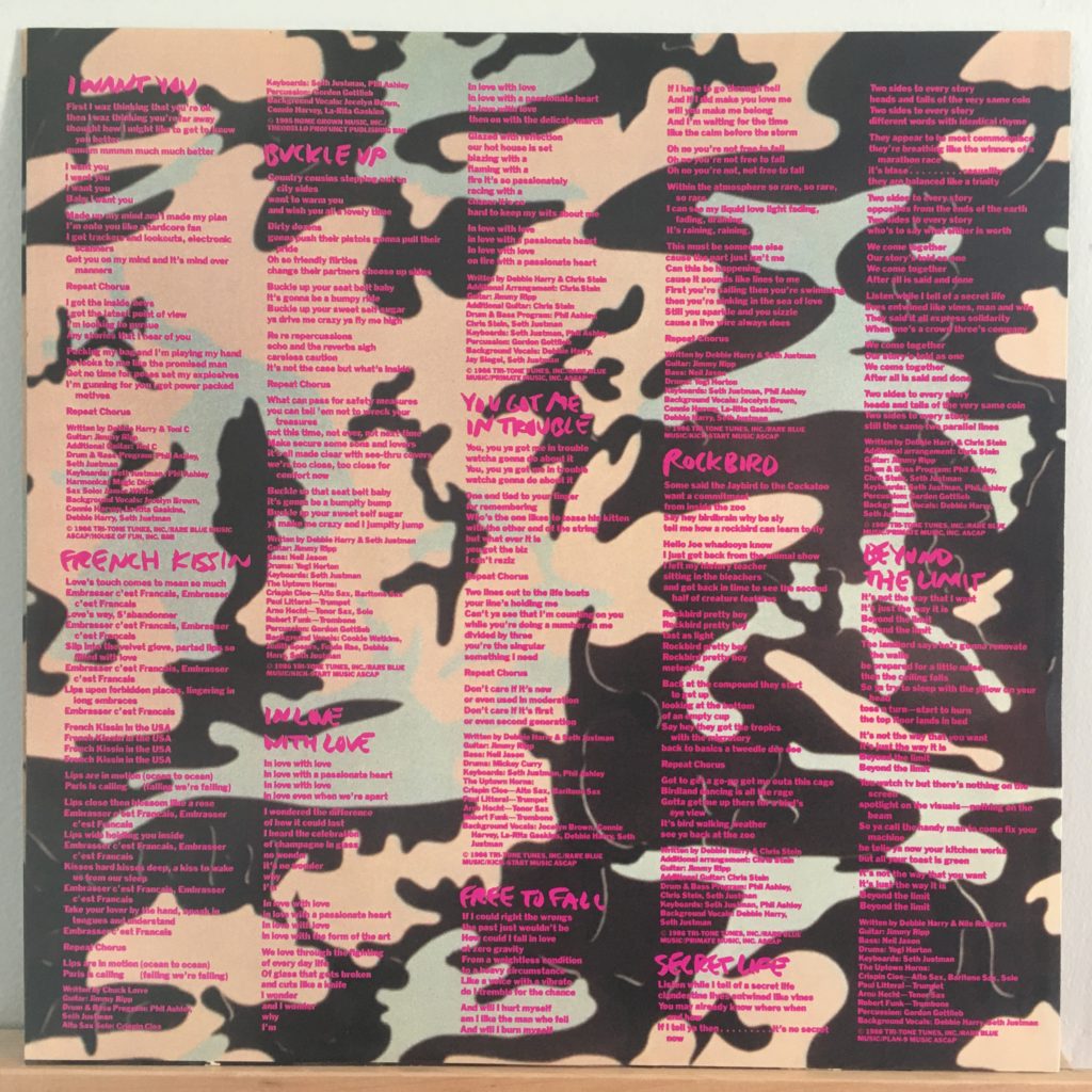
This has always been a favorite, especially for “French Kissin’,” “I Want You,” “Buckle Up,” and “In Love With Love” — the entire A side, but the B doesn’t suck, with “Free to Fall” and “Beyond the Limit.”
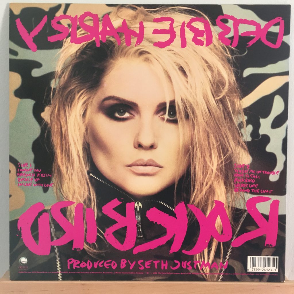
The design, the feel, it’s very much of the time, but typical of her approach, it looks grittier than what was going on at the time (think of a world overwhelmed by Patrick Nagel’s overly clean lines). Sprouse’s design over a Warhol painting background looks fresh, bright, exciting, but downtown somehow. (The record was issued in several different color schemes — that I got the one that is probably hardest for my colorblind eyes to read is par for the course.) 1986 was a bright, promising time for me, but a time of change. Sober and full of energy, but also afflicted by grief, trying to figure out what our lives would be like, what directions we should take, what we should do with ourselves. Of all the music I embraced at that time – Elvis Costello, Kurt Weill, Eurythmics, Dead Kennedys — this was probably the simplest, the brightest, the poppiest. And there’s something about the cover that, to me, just feels like that time. It’s a perfect time capsule.
I don’t play it nearly enough — to my mind, it was somewhat overshadowed by Deborah’s brilliant “Def, Dumb & Blonde,” which takes this approach to the next level and was a favorite play for years. I don’t have that on vinyl, so this’ll do it for Ms. Harry’s entries into my collection, but it’s a nice way to go out.
