1.4.5. – Pink Invasion
This one took a while to write, because in my entire record collection, there isn’t a record with a more personal connection – because this is the only record I ever designed a cover for.
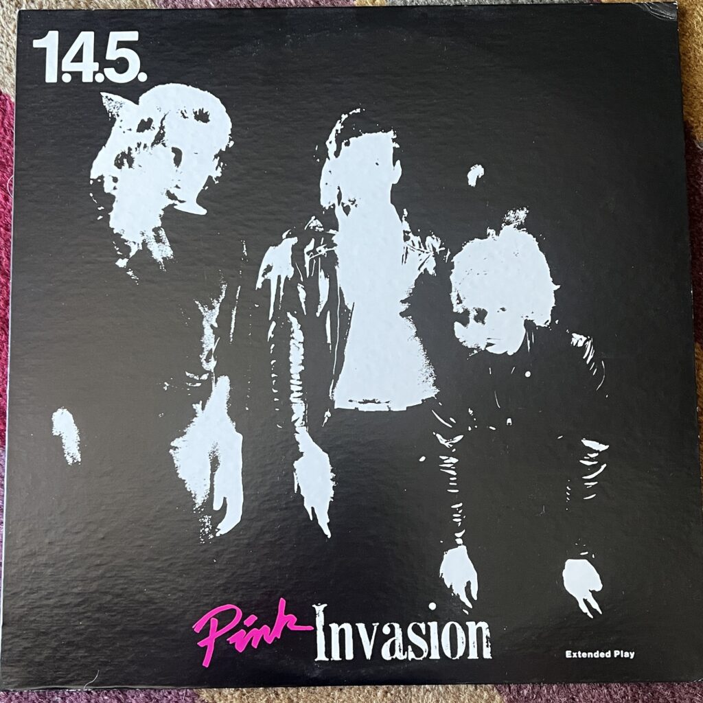
How did that come about? Well, I had a good friend who was a very skilled photographer who regularly did some shots of some of our favorite local bands, and had her work featured on some classic local releases of that era.
There was an incredible Syracuse band called The Flashcubes – now, very deservedly, in the Power Pop Hall of Fame. The members of the band have had long, successful careers in music, and their time as The Flashcubes marked a hugely important time in the lives of many of their fans. They started in 1977, before I lived in Syracuse; I didn’t get hip to them until just about the beginning of 1979, and they quickly became – for me, for my fellow musical traveler and roommate Danny, for my eventual spouse – the most important band in our lives. We saw them every chance we got, mostly at the legendary Jabberwocky, a Syracuse University student club that was the center of our social lives for several years. Their songs, their performing energy, the tremendous sense of fun, the communal pogo dancing – it was utterly perfect for that time in our lives.
But, it was a band, and bands have problems, and one of their guitarists, Paul Armstrong, left the band. Armstrong first formed The Most, fronted by Dian Zain, and then in 1980 he formed a new band, 1.4.5., a power pop trio with Dave Devoe on bass and Ducky Carlisle (from The Ohms) on drums. (Eventually, The Flashcubes that remained rebranded as Screen Test.)
My friend Barb, the photographer, trusted me so much she let me drive her Pacer while she was away on spring break – I’m not clear whether she understood how little experience I had with a stick shift at that point, but it hardly mattered as her first gear truly did not work, and she lived on one of Syracuse’s more extreme hills, which made for some excitement getting out of parking spots with a sudden lurch into second gear. She apparently also trusted my extremely rudimentary design sensibilities enough to bring me into a handful of paying gigs. I had done a lot of newspaper and magazine layout and design, nothing earth-shattering but also nothing I’m ashamed of, and I liked testing the limits of reproduction. Most times it worked, sometimes it didn’t, but my style was clean and legible. And since I worked in offset production, I had a pretty good idea of what I was doing. So it wasn’t completely off the wall for her to ask me to do design. When 1.4.5. was going into a real studio to cut an EP – a very big deal for any band in 1981 – they asked Barb to do their photos, and I got asked to do the design.
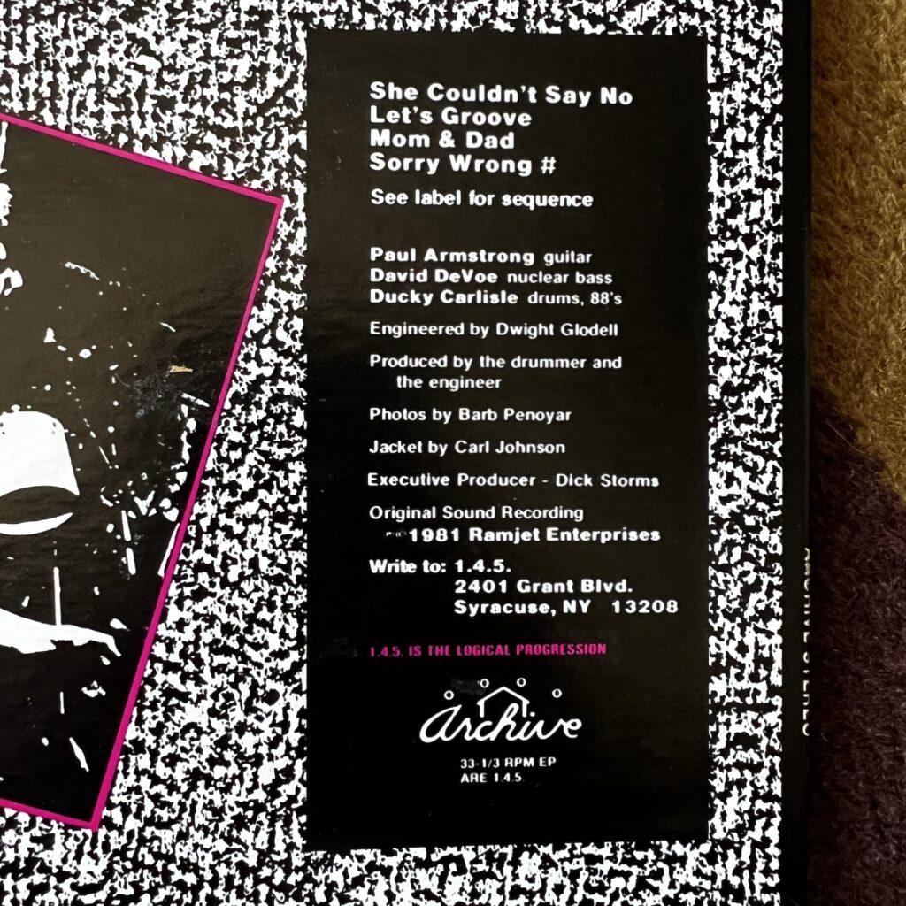
The design (perhaps more than the music) is very much of its time. I can take no credit or blame for the 1.4.5. logo; they had that long before me. The front cover features brushwork lettering for “Pink” and some lead type that I printed lightly for a distressed effect. (The rubber stamp look was all the rage.) In retrospect, I’d have bumped up the size of the “Pink.” The back cover is where I actually had to do some design, most of which was accomplished with a Letraset texture (I had a budget!). I set the type at my job, sticking it to the man. I still think this looks fine, given what I had to work with – I had to resist going overboard with the single additional color I had to work with.
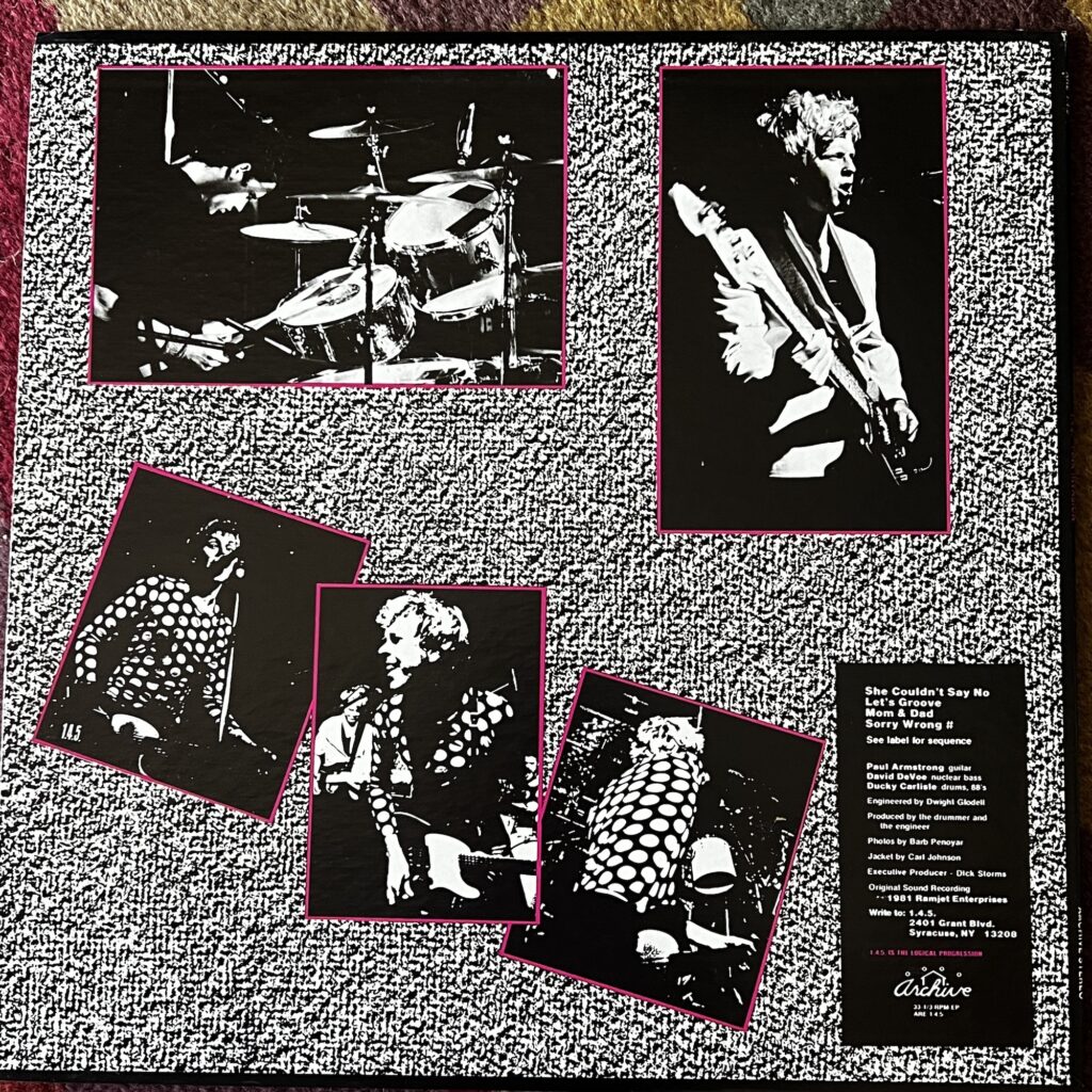
In the end, I not only got paid pretty well for it (as production work goes), but the label liked it so much they asked me if I wanted to do more for them. But I knew I was no designer, and part of what made it work economically was that I was able to steal some of the means of production from where I worked – if I’d had to pay out $8 for every velox I needed, I could never have made any money on the project.
By the way, if you look this up on Discogs, it’ll tell you the design is by some other person with my name. I promise this was not designed by US soul drummer/songwriter Carl Ray Johnson.
That was all the upside. The downside was that this project all happened during a terrifically dark, depressed, alcoholic period of my life, the summer of 1981. I’m glad to say that I don’t really associate it with that, but I also can’t forget where my head was when I did this project, and it wasn’t in a good place. (See also: Sandinista.)
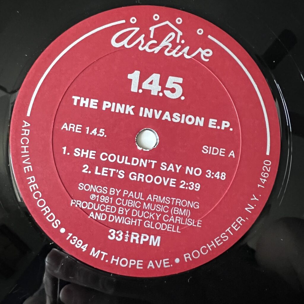
So: onto the songs.
Well, like The Flashcubes (whom I should have really covered even though I only have them on 45) and Screen Test, and My Sin, and Dress Code – this is the music of my young life. This is music I was somehow intimately involved with, music we went to hear at our local clubs over and over, music we thrilled to hear the first notes of. So, yeah, it’s pretty great. And even without that, I think a couple of the tracks are solid standouts on their own. “Sorry, Wrong #” is just a bop, as is “Let’s Groove.” This was great pop rock, and so fun.
I’ll admit I’m a little disappointed that this fairly obscure little EP doesn’t trade for higher dollars – Discogs says the highest it sold there was $20. An album by The Trend, younger kids out of the same scene, has sold for $100, and their 45 (!) has sold for $1200. I know I’ve been offered hundreds for the album. Somehow The Trend found a crazy audience.
Things We Said Today